This article by Datacolor Product Manager Danielle Thome originally appeared in Quality Magazine.
If you’re like many people, color plays a significant role in many purchasing decisions — from clothes to roof tiles to fresh produce. According to Roseanna Roberts, former director of trends at The Color Association of the United States, 85% of consumers attribute color as a primary factor in their purchasing behavior
Designers, product managers, color managers and color developers in many industries pay close attention to color management at every stage of development and production. Although the colors shoppers like, or expect to see, play a role in how they evaluate a product or the package it comes in, several other factors can influence their opinions about quality, often subconsciously.
As a result, manufacturers are increasingly turning to digital color management tools to set their products up for success — achieving greater precision, improving formulations, and streamlining production.
The Color of Quality
Consistency is one of the most significant factors that impacts color perception. If multiple shirts of the same design are hanging on a rack, even subtle variations among them will suggest some flaws to many consumers.
It’s even more important for colors to match or be aligned in a complementary way when two or more products go together. Consistency also comes into play when a single product is created with multiple materials that all need to be the same color.
It’s not enough for colors to match when you produce a product; you also need to consider its lifecycle, as well as how resistant a color is to fading, running, rubbing off, or other effects that can cause it to become dull or change shade, such as exposure to chemicals, detergent, sunlight, heat or sweat.
For example, a neon pink swimsuit will face more fastness challenges than most other garments. Sun, salt water and chlorine can all cause colors to weather and fade faster, even before you factor in routine washing and other wear and tear. In addition, neon pigments tend to have less light and washing fastness than other types of dyes.

In plastics, it’s equally important to consider the manufacturing process, how it affects the final product, and how that product will be used. Phenomena like thermochromism (how the color responds to temperature changes), stress whitening and chemical reactions that can occur between pigments and chemicals in production need to be anticipated. Can the chosen pigments withstand high temperatures of the extrusion process and still possess the desired final color? Is the finished product meant to be pliable? Will the color change over time with intended use? Will the chosen pigments make the plastic prematurely brittle? All these factors can impact perceived and actual quality.
Another aspect to consider is the desired strength of the color. This parameter typically is used to judge the consistency of raw materials as well as assist in correcting production color batches of finished products.
Opacity is an important index to account for as well, especially in the paint and plastics industries. Most paint products strive to be opaque. This feature is helpful when painting a lighter finish color over a darker wall to allow for fewer coats. Wood stains, however, need less opacity and are more transparent and translucent. Controlling the amount of opacity in these products is key to the final look of the desired woodgrain. It’s also important when printing signage that needs to be backlit or creating translucent plastics like shower curtains.

The Eyes Don’t Always Have It
Color is often visually assessed by trained evaluators who have successfully completed standardized color tests. Although these experts will continue to play roles for years to come, especially when it comes to complex materials or samples, individual assessments are never completely free from subjectivity. Results can be impacted by an evaluator’s background, surroundings, and even an individual’s current mood.
A proper viewing area, such as a light booth, is critical to help evaluators see colors as accurately as possible. It’s also important to use multiple types of light sources. Different materials, dyes and pigments reflect light in different ways, often with significant effects on color perception.
For example, the formula used to produce the same color in two different materials might result in products that appear to match under the type of incandescent lights most often used in retail stores. Yet the colors of those same two items might look very different when viewed outdoors in bright sunlight.
Measure Twice (Or More), Color Once
The most effective quality control (QC) practices in use today combine visual assessments with digital evaluation, which provides more objective and precise ways to assess and review colors.
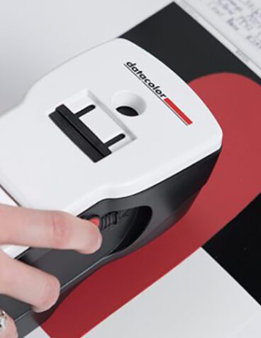
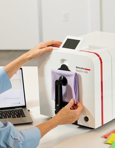
Color measurement instruments provide reliable and consistent benchmarks for QC and formulation software. Spectrophotometers can read wavelengths of light to create a unique reflectance curve. This measurement effectively provides a “fingerprint” for the color, enabling extremely predictable matching. Reflectance curves can be stored in an electronic file format known as QTX, which can be used to import color measurement data into QC software or exchanged with supply chain partners.
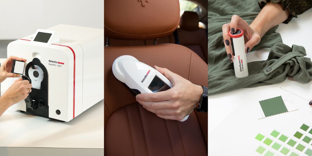
Color measurement instruments come in various configurations, each designed for different needs and budgetary levels. Three common ones are:
- Benchtops — The most accurate instruments, primarily used in labs and other stationary environments
- Portables — Capable of being moved around a plant or in the field for a variety of applications, often used on production lines
- Color lookup — Small and inexpensive units ideal for retail and consumer markets
The more precision you need, the more you’ll benefit from higher-quality instruments. You’ll also want to ensure the instruments you’re using have close inter-instrument agreement with those used by your vendors, customers, and partners.
Talk The Talk
Whether you’re conducting visual or digital evaluation, proper color communication is essential when working with your supply chain. If a sample doesn’t match your desired standard, telling a vendor that the color is “ugly” or “wrong” won’t provide the guidance they need to make it correct.
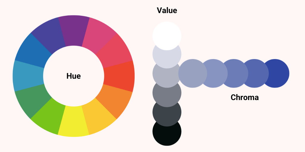
Instead, color professionals use three clearly defined descriptors:
- Hue —Is there too much or too little of a shade of color in the formula?
- Chroma — How saturated is the color?
- Value — Does the color need to be lighter or darker?
This is an area where digital color management tools can help guide you, ensuring that you’re getting a proper measurement, and utilizing QC software to provide the suggested descriptors when discussing differences between your sample and your standard.
Best Practices for Digital Color Workflows
Digital tools can enhance every stage of your color workflow. Let’s look at how they can be applied effectively throughout the process.
Find Inspiration
Many designers like to start with something physical that features a desired color. That’s fine in the developmental stage. But once you have your inspiration, you’ll want to capture its color data with a spectrophotometer or other measurement tool. Then you can utilize your hardware and software tools to find the closest match in your color library.
Choose Color Standards
Before you start looking for one or more inspirational colors, it’s best to establish a color standard. Some large companies with advanced color management processes create their own, but most of the time it makes more sense to work with established color libraries from a color standard provider. In addition to saving time and easing supply chain communication, you may benefit from digital measurements and/or fastness tests your provider has already performed.
Set Your Tolerance
Tolerance defines how much any given sample can be permitted to vary from your standard. It’s calculated from lightness, chroma and hue, and values greater than 0.8 to 1.0 total color difference (dE) can typically be perceived by an untrained human eye. Some large global brands require much tighter tolerance values, while products like dog toys might allow more variation.
Multiple variables need to be considered when setting your color tolerance. These include the end use of the product; the hardware, software and light sources used for color measurement; and the capabilities of your partners. If your tolerance is too tight, your supply chain might struggle to achieve it. Too loose, and your products could risk looking inconsistent.
Some manufacturers specify different tolerances for specific colors. Neutrals are sometimes assigned tighter tolerances because hue shifts are easier to detect. You’ll also want to set tolerance levels for raw materials and measure samples of each new shipment to ensure consistency.
The Digital Difference
Digital color management provides powerful ways to save time and money while improving accuracy, consistency and customer perceptions. Hardware and software tools are available in multiple levels depending on your budget, experience with color management and the level of control you need. Some companies also have dedicated specification teams to help you find the equipment and software that are right for your operation.