By Karine Bengualid
Whether we notice it or not, colors play an important part in our day-to-day lives, whether you’re taking the kids to school or working at a manufacturing plant. Some of these colors symbolize the same thing no matter the language you speak or the country you’re from: Green means go (or safe), yellow means caution, red means stop (or danger).
This is why using colors is important in our world. It can transcend language and cultures and explain some of the most rudimentary (and important) meanings like stop, caution, go, help.
It can also send a brand to the patent office, hoping to secure their colors from would-be copycats with a color trademark.
In honor of International Color Day on March 21, we decided to explore two colorful legal topics: safety colors and meanings and the world of color trademarking.
Safety Colors and Signs in the United States

There weren’t always standards when it came to safety signage. Thankfully, we’ve come a long way since then. Here’s a look at the critical role safety colors and their meanings play in workplace safety today:
Warning categories and associated colors, per OSHA (Occupational Safety and Health Administration)
- Danger: red and letters or symbols should be a contrasting color to ensure maximum visibility (such as white). The danger is imminent.
- Warning: orange and letters or symbols should be a contrasting color to ensure maximum visibility. The warning is for a risk that is not severe or immediate.
- Caution: yellow. This category is to alert of potential risk.
- Biohazards: fluorescent orange or orange-red. The risk is to human health or the environment.
Safety color categories, per ANSI (American National Standards Institute)
- Red: safety signs, labels and other objects to signal danger and to stop.
- Orange: dangerous parts of a machine or equipment that can cause crushing, cutting, shocking or other bodily harm.
- Yellow: cautionary color signaling the risk of tripping, falling, slipping, getting burned, hearing damage, and other hazards.
- Green: emergency egress (exit) to show the escape route if needed, as well as first aid and safety equipment.
- Blue: informational signs or labels, not necessarily safety related.
- Black and white: guiding traffic and housekeeping information in facilities. Not specifically safety-related, however this information helps improve safety.
- Purple: radiation hazards.
- Gray: reserved for future use by ANSI.
Safety Colors on an International Scale
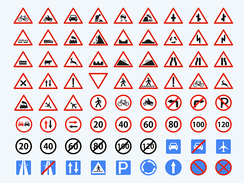
The world has become a smaller place. With that, the need to have safety signs understood no matter your language or culture is one of critical importance. Not having a standard adhered to around the world can mean confusion and accidents—particularly for tourists or foreign workers.
Jan-Bernd Stell, chair of the ISO (International Organization of Standardization) technical committee that developed the standard for international safety signs said, “International standardization of safety signs means everyone speaks the same language when it comes to safety. This provides a simple solution for everyone, both in workplaces and public areas like airports where many nationalities converge.”
Meanwhile in marketing: Trademark Color Protections

Did you know that colors can be the subject of trademark protection? Just like safety signs, you might not think much about the colors of your favorite products and brands, but there’s nothing quite like a legal battle to catapult those brand colors into the spotlight.
To be able to receive trademark rights for a color, the color must:
- Be an identifying marker for the brand’s goods and/or services amongst consumers
- Not be used strictly for decorative purposes. Common examples of this would be Tiffany’s signature blue boxes, T-Mobile’s magenta logo, The Home Depot’s orange mark, or the red lacquered outsoles of Louboutin’s shoes.
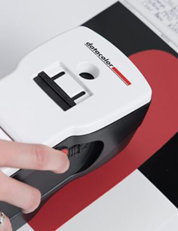
We asked Kenny Thomas, one of Datacolor’s color technology specialists, his thoughts on color trademarking.
“A single color alone is near meaningless. Fiberglass that is naturally neutral has no reason to be pink. The sole of every shoe has no reason to be red lacquer. That level of arbitrary uniqueness should be required for trademarking color.”
How Did Color Trademarks Start, Anyway?

At first in the United States, the law did not recognize a single color as a brand, but combinations of colors were protectable by a color trademark.
The change came about when Owens-Corning created their now famous “Think Pink” campaign for their fiberglass building insulation which was (and continues to be) pink. Then, in 1985, a U.S. Court of Appeals in Washington ruled that Owens-Corning had earned the right to prevent their competition from using pink for their insulation.
How Do Courts Know if a Color Infringes on a Color Trademark?

Fire-engine red. Royal blue. Burnt orange. Those might be enough to indicate to the average person what color you’re talking about. However, in the case of trademarking colors, specificity will always win out, especially in the courtroom.
Using ink-matching techniques is a more scientific method—though it does have its drawbacks. Not only do these systems help define the shade of a color, but they also allow you to protect around it. For example, a color trademark might include 10 shades on either side of a color in the Pantone Matching System, which contains 1,867 colors.
Datacolor’s Textile and Apparel Market Manager, Dustin Bowersox, weighs in on the drawbacks of this approach: “The court’s use of the Pantone system brings less subjectivity to the discussion. But if courts were serious about utilizing science to develop guidelines for infringement, identifying color differences using a high-end color measurement instrument seems like the most accurate way to establish, communicate, and validate the rules when establishing trademarked colors.”
In other words, instruments and software designed specifically for measuring and analyzing color can provide much more objectivity than visually assessing 1,867 colors and their closest shades.
What Colors Cannot be Trademarked?

Functional colors cannot be trademarked in the U.S., meaning colors that are utilitarian or indicate a characteristic of the product or service such as its flavor or ingredients. For example, if you make lawn mowers, you cannot “own” the color green because that’s the color of lawns (hence, a functional color). Another way to put it: Would trademarking this color put competitors at a disadvantage?
However, Qualitex, a manufacturer of dry cleaning and apparel press pads, can trademark or “own” their green since it’s not a functional color in their industry. And they did.
But even if you trademark a color, there are still limits.
Trademarking a color only protects its use within its own industry, according to a Business Insider article. The article explains, Target can’t sue Coca-Cola (or Datacolor) for using similar shades of the color red since they are not selling competing products.
Kenny Thomas says, “If we’re shopping at Target, we recognize ‘Coke Red’ and ‘Target Red’ logos (both trademarked) not because of the red itself but by context – even if the context involves chromatic adaptation under different lighting. We aren’t confused that we’re buying Target’s version of Coke – even though the two reds overlap plenty in reproduction.”
Notable Color Trademark Cases
Deutsche Telekom (T-Mobile Parent Company) vs. Lemonade: As we mentioned above, the telecom giant T-Mobile filed a cease and desist (of using their color) to Lemonade, a small home insurance company in the U.S. Because they’re in different industries, it’s likely T-Mobile won’t win this battle of the hues.
Prince vs USPTO: Since Prince’s untimely passing in April 2016, his estate has filed several requests to trademark his infamous purple color—a color that is ubiquitous with the artist. The USPTO denied applications for use of the color in connection with “musical sound and video recordings,” “entertainment services,” as well as “live performances and museum services.”
Whether it’s keeping us safe or giving products a unique identity, there’s no denying the power of color—on the road, in our workplaces, in our favorite stores, and everywhere in between.
Want to learn more about the influence of color? Read the other posts in this series: