By Karine Bengualid
Color is far more than a design choice. Whether it’s used on a safety sign, an emergency exit, a product label or a company’s logo, color communicates information long before a single word is read.
Red often signals danger or stop. Yellow warns us to proceed with caution. Green typically indicates safety, first aid or an emergency exit. These visual cues help people react quickly—even when they don’t speak the same language.
Color also plays an essential role in branding. Some companies become so closely associated with a specific color that it becomes one of their most valuable business assets. In certain circumstances, that color may even qualify for trademark protection.
For manufacturers, brand owners and quality professionals, however, one challenge connects both safety colors and trademarked colors:
Consistency.
A safety sign must communicate the same message every time it’s seen. Likewise, a trademarked brand color should appear consistent across products, packaging, suppliers and manufacturing locations.
Objective color measurement helps organizations achieve that consistency by replacing subjective visual assessments with measurable color data.
In this guide, we’ll explore:
- Why color matters in safety communication
- How safety colors are standardized
- How international safety signs improve communication
- How color trademarks work
- Why objective color measurement supports legal and brand consistency
For broader context, see The Art and Science of Digital Color Management and explore Datacolor’s Color Management Solutions.
Why Color Matters in Safety and Law
Color communicates information faster than text.
Every day we rely on color to make rapid decisions in situations ranging from crossing a street to operating heavy machinery.
Examples include:
- Traffic lights
- Emergency exits
- Hazard labels
- Fire safety equipment
- Workplace warning signs
- Product safety labels
In many situations, people recognize the meaning of a color before reading the accompanying message.
This ability makes standardized color systems extremely valuable in workplaces, transportation hubs, hospitals and public facilities around the world.
Color also carries significant commercial value.
Over time, consumers often begin associating a particular color with a specific company or product.
Examples frequently cited include:
- Tiffany & Co.’s iconic blue packaging
- T-Mobile’s magenta branding
- The Home Depot’s orange
- Christian Louboutin’s signature red soles
In both safety communication and branding, consistency is essential.
If a safety color changes too much, it may reduce recognition and increase confusion. If a brand color varies between production runs, it can weaken brand identity and customer trust.
For more about why people perceive colors differently, see:
Safety Colors and Signs in the United States

Safety colors are designed to help people recognize hazards quickly and consistently.
In the United States, workplace safety colors are primarily influenced by organizations such as the Occupational Safety and Health Administration (OSHA) and the American National Standards Institute (ANSI).
Although their standards serve different purposes, both organizations aim to improve workplace safety through consistent visual communication.
Common OSHA Warning Categories
OSHA identifies several warning categories that use specific colors to communicate different levels of risk.
| Category |
Typical Color |
Purpose |
| Danger |
Red |
Immediate hazards requiring urgent attention |
| Warning |
Orange |
Serious hazards that are not immediately life-threatening |
| Caution |
Yellow |
Potential hazards requiring awareness |
| Biological Hazard |
Fluorescent Orange or Orange-Red |
Biological risks to people or the environment |
High contrast between symbols and background colors is also recommended to maximize visibility and readability.
ANSI Safety Colors
ANSI standards provide additional guidance for safety labels, workplace signage and facility markings.
| Color |
Common Meaning |
| Red |
Danger, stop or fire protection equipment |
| Orange |
Hazardous machinery or equipment |
| Yellow |
Caution and physical hazards |
| Green |
Safety equipment, emergency exits and first aid |
| Blue |
General information |
| Black & White |
Traffic and housekeeping information |
| Purple |
Radiation hazards |
Organizations manufacturing safety-critical products should ensure these colors remain consistent throughout production to maintain compliance and effective communication.
Related reading:
Safety Colors on an International Scale
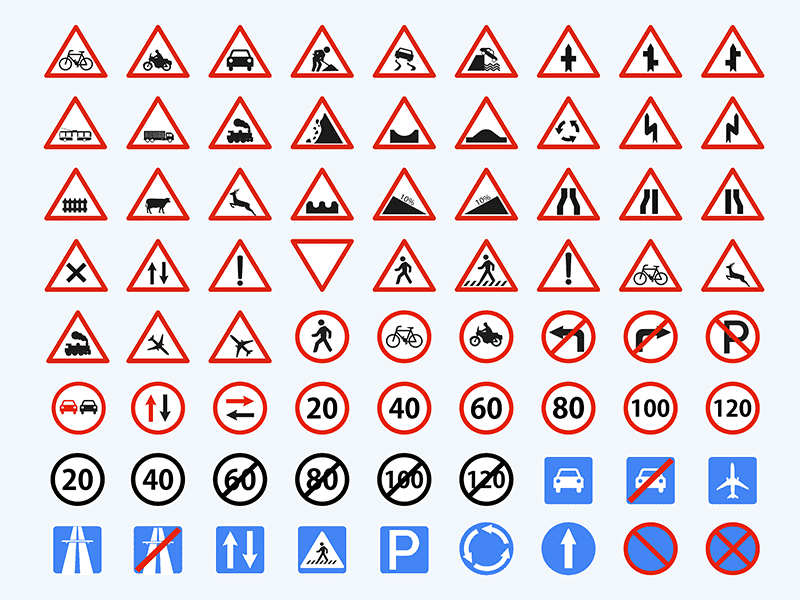
As global trade and international travel continue to grow, safety communication must work across languages, cultures and geographic regions.
Manufacturing facilities, airports, hospitals, transportation hubs and construction sites often serve people from dozens of different countries. In these environments, relying solely on written instructions is rarely sufficient.
Standardized safety colors and symbols help people recognize hazards instantly—even if they cannot read the local language.
This is one of the primary reasons why international safety standards have become increasingly important.
The Role of ISO Standards
The International Organization for Standardization (ISO) developed ISO 7010 to create globally recognized safety signs.
Rather than requiring people to understand written instructions, ISO 7010 combines standardized:
- Colors
- Symbols
- Shapes
- Pictograms
These visual elements help communicate critical information consistently around the world.
ISO 7010 works alongside related standards such as ISO 3864, which provides guidance for the design, shape and color of safety signs.
The objective is simple:
Allow anyone, regardless of language or nationality, to recognize important safety information immediately.
Examples include:
- Emergency exits
- Fire extinguishers
- Mandatory protective equipment
- Electrical hazards
- First aid stations
- Evacuation routes
Why Standardized Colors Matter Globally
For companies operating internationally, safety colors are far more than a design preference.
Many organizations manufacture products that are distributed across multiple countries, each with its own regulations and customer requirements.
Maintaining consistent safety colors helps organizations:
- Reduce misunderstandings
- Improve workplace safety
- Support regulatory compliance
- Increase product consistency
- Improve global supplier alignment
A safety label that varies noticeably in color between manufacturing locations may reduce recognition or fail to meet customer expectations.
This is where objective color measurement becomes essential.
Rather than relying on visual inspection alone, manufacturers can define measurable color standards that every supplier follows.
Related reading:
Color Trademarks and Brand Protection

Color doesn’t only communicate safety—it also communicates identity.
Some companies become so closely associated with a particular color that consumers immediately recognize the brand without seeing its name.
In certain situations, that color may qualify for trademark protection.
A color trademark does not give a company ownership of a color in every context.
Instead, it protects the use of a specific color when consumers associate that color with a particular source of goods or services.
When Can a Color Become a Trademark?
Although legal requirements vary by jurisdiction, a color generally needs to satisfy several conditions.
It should:
- Identify a specific brand or company.
- Be recognized by consumers as a source identifier.
- Not simply serve a decorative purpose.
- Not be functional within the product category.
Some well-known examples include:
- Tiffany & Co.’s signature robin’s egg blue packaging.
- T-Mobile’s magenta branding.
- The Home Depot’s orange.
- Christian Louboutin’s red lacquered shoe soles (in specific contexts).
Although consumers may simply recognize these colors instinctively, maintaining that recognition requires remarkable consistency across every product, advertisement and manufacturing partner.
Related reading:
How Color Trademarks Developed in the United States

Single-color trademarks were not always recognized by U.S. courts.
Historically, trademarks primarily protected words, logos and combinations of visual elements.
Over time, however, courts acknowledged that a single color could also function as a brand identifier when consumers strongly associated that color with one company.
One of the most frequently cited examples is Owens Corning’s pink fiberglass insulation.
Following years of consistent marketing—including the famous “Think Pink” campaign—consumers began associating the color pink directly with Owens Corning’s insulation products.
This helped establish one of the earliest and most influential examples of a protected single-color trademark in the United States.
Today, this case is often referenced when discussing how colors can evolve into valuable intellectual property.
Defining a Trademarked Color
Successfully protecting a brand color requires much more precision than simply calling it “red,” “blue” or “green.”
Even descriptive names such as:
- Fire-engine red
- Royal blue
- Forest green
- Burnt orange
are far too subjective for technical color control.
Instead, manufacturers increasingly rely on objective color measurement and standardized color systems to communicate exact color specifications.
Related reading:
How Courts and Brands Define Color Differences

When color becomes part of a legal dispute, subjective descriptions are no longer sufficient.
Terms like fire-engine red, royal blue or forest green may help people visualize a color, but they don’t provide the precision needed for legal protection or manufacturing.
Two colors that appear almost identical to the human eye can produce measurable differences under controlled conditions. Likewise, colors that look similar under one light source may differ considerably under another.
For this reason, companies increasingly rely on objective color measurement rather than visual descriptions alone.
From Color Names to Measurable Data
Historically, many companies referenced printed color libraries such as Pantone® when communicating brand colors.
Although these systems provide a useful common reference, they still depend on visual comparison.
Several factors can influence how a color appears, including:
- Lighting conditions
- Surface texture
- Gloss level
- Material type
- Observer perception
- Age of printed reference guides
Because of these variables, visual comparison alone may not provide sufficient accuracy for trademark protection, quality control or supplier communication.
Objective Color Measurement
High-quality spectrophotometers measure color numerically instead of relying on human perception.
Using standardized color spaces such as CIELAB, manufacturers can define exact color targets and compare production samples against measurable tolerances.
This enables organizations to:
- Maintain consistent brand colors.
- Validate supplier output.
- Reduce subjective approval decisions.
- Document compliance.
- Support intellectual property protection.
Related reading:
What Colors Cannot Usually Be Trademarked?

Not every color can qualify for trademark protection.
One of the most important limitations involves functional colors.
A functional color performs a practical purpose or describes an important characteristic of a product.
If allowing one company to exclusively own that color would unfairly disadvantage competitors, trademark protection is generally not available.
Examples of Functional Colors
Consider a lawn mower.
Green is strongly associated with grass and gardening equipment. Allowing one manufacturer to own the color green for lawn mowers could create an unfair competitive advantage.
Similarly, many industries rely on colors that carry universally recognized meanings, such as:
- Red for fire protection equipment
- Yellow for caution labels
- Orange for safety warnings
- Green for emergency exits
These colors generally cannot become exclusive trademarks because they serve important functional or regulatory purposes.
When Can a Color Be Protected?
A color is much more likely to qualify for trademark protection when:
- It has no functional purpose.
- Consumers strongly associate it with one company.
- It distinguishes a specific product or service.
- Its use would likely cause confusion if copied by competitors.
Even then, protection is usually limited to a specific product category or commercial context rather than the color itself.
For example, two companies operating in completely different industries may legally use similar shades of red because consumers are unlikely to confuse the products.
Notable Color Trademark Cases

Several well-known legal disputes demonstrate both the value and complexity of protecting brand colors.
Owens Corning and Pink Insulation
Owens Corning successfully established one of the first widely recognized single-color trademarks in the United States through decades of consistent branding around pink fiberglass insulation.
T-Mobile and Magenta
T-Mobile actively protects its distinctive magenta branding.
Cases involving similar shades demonstrate that trademark enforcement often depends on whether consumers are likely to confuse one company’s products with another’s.
Prince and Purple
Purple became closely associated with the musician Prince throughout his career.
Despite this strong cultural association, obtaining trademark protection for a color remains legally challenging because trademark rights require more than public recognition alone.
Lessons from These Cases
These examples show that successful color trademarks depend on several factors working together:
- Consumer recognition.
- Commercial context.
- Distinctiveness.
- Consistent long-term use.
- Objective color definition.
For manufacturers, maintaining color consistency across suppliers becomes just as important as establishing the trademark itself.
Why Objective Color Measurement Matters
Whether colors are used for safety signage or brand identity, consistency remains the common goal.
Subjective descriptions such as “slightly darker,” “too orange” or “close enough” leave too much room for interpretation.
Instead, objective color measurement allows organizations to define measurable standards that can be communicated consistently throughout the supply chain.
A robust color management workflow typically includes:
- Approved color standards
- CIELAB or spectral color data
- Specified illuminants and observers
- Defined Delta E tolerances
- Controlled viewing conditions
- Documented supplier requirements
- Digital color communication
Using measurable color data helps manufacturers reduce disputes, improve quality control and maintain stronger brand consistency across global production networks.
Related reading:
Best Practices for Managing Regulated or Protected Colors
Whether you’re managing safety signage, regulatory markings or trademarked brand colors, consistency starts with a documented color management process.
Organizations that rely solely on visual inspection often experience unnecessary variation between suppliers, production facilities and approval teams.
The following best practices help reduce that variability while improving quality, traceability and supplier alignment.
1. Define Colors Using Measurable Data
A color should never be specified only by its name.
Terms such as “bright red” or “deep blue” are subjective and can be interpreted differently by different people.
Instead, define colors using objective color data, such as:
- CIELAB values
- Spectral data
- Approved physical standards
- Documented viewing conditions
This creates a common reference for every supplier and manufacturing location.
2. Specify the Material and Application
The same color can appear noticeably different depending on the substrate.
Examples include:
- Plastic
- Textiles
- Metal
- Paper
- Paint
- Powder coatings
- Digital displays
- Printed packaging
Color specifications should therefore always include the intended material and production process.
3. Standardize Lighting Conditions
Lighting has a significant influence on perceived color.
Even perfectly matched samples may appear different when viewed under daylight, LED lighting or fluorescent illumination.
For reliable visual assessment, organizations should use standardized viewing conditions with calibrated light booths whenever appearance is critical.
Related reading:
4. Measure Colors Objectively
Modern spectrophotometers allow manufacturers to compare production samples directly against approved standards.
This minimizes subjective decision-making while providing traceable measurement data for quality control.
Objective measurement also makes supplier communication significantly more efficient.
5. Align Suppliers Early
Color requirements should be clearly communicated before production begins.
Every supplier should understand:
- The approved color standard
- The measurement method
- Acceptable Delta E tolerances
- Viewing conditions
- Approval procedures
Clear specifications reduce rework, rejected batches and unnecessary production delays.
Related reading:
6. Maintain Complete Documentation
Keeping digital records of color standards, measurements and approvals improves traceability throughout the product lifecycle.
This documentation can support:
- Internal quality audits
- Supplier performance reviews
- Regulatory compliance
- Brand consistency initiatives
- Future product development
How Datacolor Supports Objective Color Control
Managing safety-critical colors, regulated product colors and protected brand colors requires more than visual inspection.
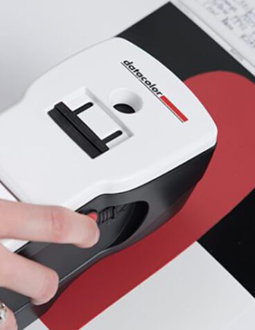
Datacolor provides integrated color management solutions that help manufacturers define, measure, communicate and control color consistently across global supply chains.
Datacolor solutions help organizations:
- Create objective color standards.
- Measure colors accurately using spectrophotometers.
- Compare production samples against defined tolerances.
- Improve supplier communication.
- Maintain digital color records.
- Reduce subjective approval decisions.
- Strengthen brand consistency.
Explore additional solutions:
Frequently Asked Questions About Safety Colors and Color Trademarks
Why are colors used in safety signs?
Safety colors communicate hazards, warnings and emergency information quickly. Standardized colors help people recognize important information before reading any accompanying text.
What does red typically mean in safety signage?
Red is commonly associated with danger, stop commands and fire protection equipment, although exact meanings depend on the applicable safety standard.
Are safety colors standardized internationally?
Many countries use internationally recognized standards such as ISO 7010 and ISO 3864 to improve consistency in safety communication, although local regulations may still vary.
Can a company trademark a color?
Yes. In some jurisdictions, a color can function as a trademark when consumers recognize it as identifying a specific source of goods or services and when the color is not functional.
What is a functional color?
A functional color serves a practical purpose or describes an important characteristic of a product. Functional colors are generally not eligible for trademark protection.
Does trademarking a color prevent anyone else from using it?
No. Protection is typically limited to specific goods, services or industries. Similar colors may still be used legally in unrelated markets.
Why is objective color measurement important?
Objective measurement reduces subjectivity, improves supplier consistency and provides measurable evidence that products meet defined color specifications.
How do spectrophotometers improve color consistency?
Spectrophotometers measure color numerically, allowing manufacturers to compare production samples against approved standards using repeatable measurement methods.
How can manufacturers improve supplier consistency?
By defining measurable color standards, setting Delta E tolerances, standardizing viewing conditions and sharing digital color data with suppliers.
How can Datacolor help?
Datacolor offers spectrophotometers, color management software, light booths and digital workflows that help organizations achieve consistent color quality across products, suppliers and manufacturing facilities.
Maintain Consistent Colors Across Products, Brands and Supply Chains
Whether you’re managing safety-critical colors, regulated product markings or trademarked brand colors, objective color measurement provides the consistency needed to improve quality, strengthen brand identity and reduce supplier variation.
Explore Datacolor Color Management Solutions


 Want to Get Color Right?