Brand FAQ: Low adoption rate for developing colors
The reasons for the low pass rate in the color development phase can be analyzed in the following aspects:
- Vendor color sensitivity and other color capabilities
- Regularity of visual color matching process
- Suppliers’ level of understanding and execution of brand color requirements
- Tools for color datamining or the use of other tools
Solution: “Three-step approach” to build a supplier color capability standard system: assessment → standardization → digitization
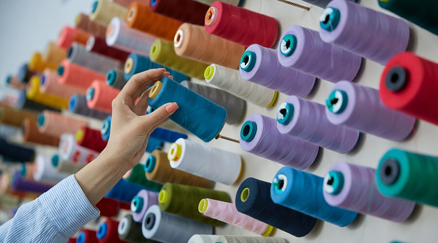
Step1: Visual Assessment
To ensure consistency in supplier color competency, it is recommended that a systematic color competency assessment be conducted for supplier personnel in key positions.
Specifically, it includes: quantifying its color sensitivity through the color vision test and the Menzel color chess test, and organizing physical comparison tests, i.e., providing standard samples and reference answers by the brand for hands-on assessment.
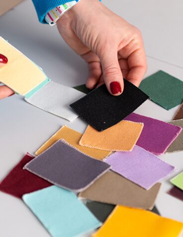
Step2: Color visual assessment process specification
After confirming that the relevant employees of the supplier have qualified color perception ability, in order to continuously improve the efficiency of color control, we can further optimize and standardize the color visual assessment process of the supplier side by combining with the brand’s color standard system.
The process may include the following:
- Selection of light boxes and lamps
- Selection of light source
- Storage and use of color cards
- Sample size and placement
- Angle of visual assessment of light boxes
- Background color and small sample treatment
- Control of temperature and humidity
- Use standard color terminology to describe color differences
- Regular color training
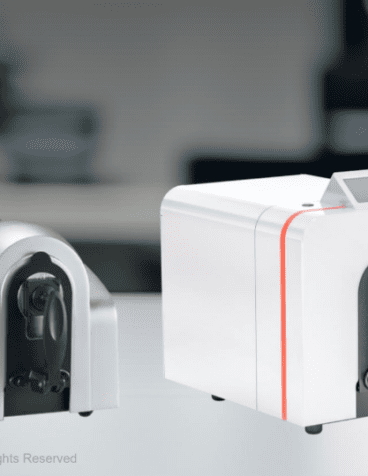
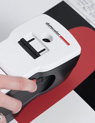
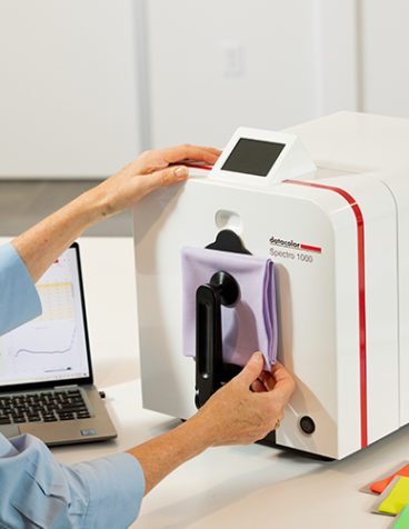
Step3: The use of spectrophotometer as a tool for color datamining
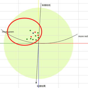
Using spectrophotometer for color difference measurement, by selecting the proper color difference formula and setting the tolerance range, most of the color samples that are obviously out of tolerance can be quickly screened and rejected, thus realizing the transformation of color assessment from subjective visual to objective data-based management. If the brand has higher requirements for color, it can be converted into digital language according to specific color preferences, and set the color difference (e.g., limit the range of brightness difference DL, color difference DC, and hue difference DH) to finely guide the production to ensure a higher degree of conformity of the color with the target direction.
As shown in the figure below, if the brand wants the color hue of the sample to be greenish, it can individually control the color separation difference of DH to achieve the consistency of the color light.
Datacolor related product recommendations:
Brand FAQs: Jumping light phenomenon
The phenomenon of light jumping, which can also be referred to as homochromatic phenomenon, refers to the phenomenon that a pair of samples matches under a certain kind of light source, but does not match under another kind of light source. There are several reasons for this phenomenon:
- Differences in light sources or lamps between brands and supply chains
- Multi-source comparison without switching light sources in color evaluation
- Problems with dye combinations
Solution: “two-pronged approach” to eliminate jump lights: hardware standardization + software data monitoring
Step1: Harmonization of light boxes and lamps and regular testing
To achieve consistency in supply chain color assessment conditions, we recommend that brands implement the following measures:
- Harmonized assessment of hardware: Standard colorimetric light box models and lamp specifications are standardized in the supply chain to ensure that all parties are using the same basic equipment.
- Establishment of light box equipment maintenance system: Suppliers are required to regularly check and maintain the light boxes and lamps and record the results to ensure that the performance of light box equipment is continuously stable and reliable.
- Standardize the visual assessment operation: In the visual assessment, the operator must use multiple light sources (e.g. D65, TL84, A light source, etc.) to conduct “light jumping” comparison, in order to check the phenomenon of homogeneous color spectrum, to ensure that the color consistency of different light sources.
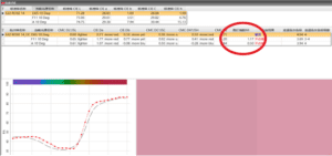
Step2: Refer to the jumping light index (MI value) in the color measurement software.
If you and your suppliers are already using a spectrophotometer system, the MI value can be read directly in the color measurement software, allowing you to objectively quantify and evaluate the phenomenon of “jumping lights”. As shown in the figure, the MI value is usually visualized as a numerical value. Generally speaking, when the MI value is less than 0.8, it can be determined that the degree of homochromatism between the sample and the standard is within the acceptable range; on the contrary, it indicates that the risk of significant color difference between the two under different light sources is high.
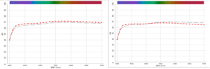
You can also view the light jumping situation through the reflectance curve, when the two colors of the reflectance curve parallel or overlap means that there will be no light jumping; and when the two curves intersect, the light jumping phenomenon will occur.
As shown in the figure below:
- The reflectance curves on the left side of the graph are parallel and do not result in skipped lights.
- If there is an intersection of the reflectance curves on the right side of the graph, then it is prone to light jumping.
Datacolor related product recommendations:
Brand FAQs: Color consistency across materials and batches
In different color stages, brands will face the problem of color matching between different materials. In the sample development stage, complex and diverse fabrics are used, and suppliers have different process and color management capabilities, which can easily lead to color problems in a series or a matching model; the cylinder difference in the large-shipment stage is also easily affected by raw materials, process, environment and other variables. Solution: 555 color separation code – using digital language to unify the color of multi-materials and multi-batches You can understand the 555 color separation code as a three-dimensional color space square composed of Lab values, with a maximum of 729 drawers defined for color separation. Different batches are automatically assigned or defined a 555 code after the LAB value is obtained by data measurement.
Such as the above chart standard value of Lab for 555 color separation benchmark, assuming that the sample and the standard color light is consistent with the sample color separation code is 555, if there is a difference in the color light exists, the color separation code correlation can refer to the following table.
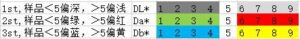
The best choice for color separation is to group color samples with the same color separation code into one category. Secondly, adjacent combinations of the same bias can be matched into one batch, while numbers going in the opposite direction indicate that they are prone to color inconsistency and thus cannot be grouped together. This will solve the problem of inconsistent colors in a series of batches.
Datacolor related product recommendations:
Datacolor is committed to turning color science into a competitive advantage in your supply chain. Not only do we provide the world’s leading color management tools, we want to be your creative partner, with the expertise to help you succeed every time.
Whether you’re facing one of the specific issues in the article or another color challenge, our team of experts is happy to listen and tailor solutions that will improve your efficiency and color quality.