Get on the Right Color Management Wavelength with Monthly Insights from 10,000+ Color Professionals Around the World.
In everyday situations, it doesn’t matter much if you think a tennis ball is yellow and your friend thinks it’s green. After all, there are a range of factors that influence color perception. For most of us, those factors lead to little more than casual disagreements.
For companies that rely on accurate color decisions, however, those differences can have real consequences. The same color sample may be approved by one person and rejected by another. A supplier may believe a production batch matches the standard, while a brand’s quality team disagrees. The result can be delayed approvals, additional lab work, rework, waste, and unnecessary costs.
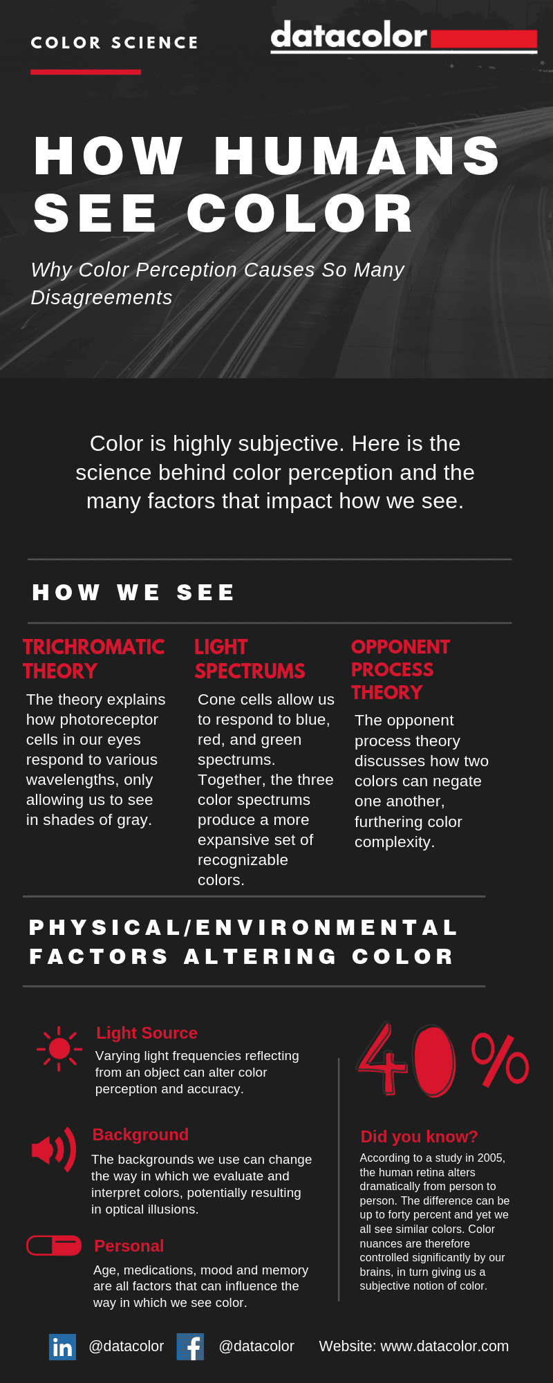
Color perception is influenced by many factors, including lighting, background, age, memory, physiology, and environmental conditions. Understanding these variables is essential for anyone involved in color approval, quality control, product development, or manufacturing.
An example: The design team at a well-known clothing brand is planning colors for an upcoming season. Someone uses the term “neon yellow.” Someone on the color team runs with this and does their best to find a color that looks like neon yellow. When the designer sees the lab dips, they look more like neon green.
The same thing can happen when color teams try to visually match a color to a production standard.
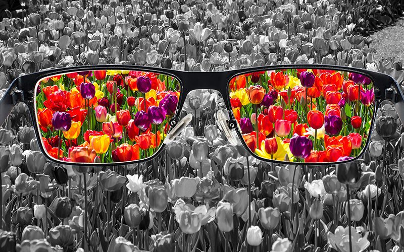
You might have 20/20 vision, but your eyesight is still unreliable when it comes to color.
Let’s take a look at some physical and environmental factors that influence color perception.
What Factors Influence Color Perception?
The most common factors that affect how people perceive color include:
Lighting and light source characteristics
Background and surrounding colors
Altitude and environmental conditions
Noise and sensory influences
Age-related vision changes
Certain medications
Memory and expectations
Mood and cognitive state
For color-critical industries such as textiles, apparel, plastics, coatings, automotive, cosmetics, and consumer goods, these factors can influence color approvals, quality control decisions, supplier alignment, and production consistency.
Understanding these influences is the first step toward achieving more accurate, repeatable, and reproducible color evaluation.
The Most Important Factor That Impacts Perception of Color Is Lighting
We only see objects when they reflect light into our eyes.
The color we see depends on the wavelengths of light being reflected.
When the visible spectrum is reflected evenly, we perceive the object as white.
When most light is absorbed, we perceive the object as black.
A red object appears red because it reflects red wavelengths and absorbs most others.
Light itself also has color characteristics.
“Cool” light contains more blue energy. “Warm” light contains more yellow energy. These differences are described by the spectral power distribution, or SPD, of the light source.
When the SPD changes, the way light reflects from a sample changes too. That means the same material can appear different under daylight, fluorescent, LED, or retail lighting.
Light sources are often evaluated by how accurately they reveal colors compared with natural light. This is known as the color rendering index, or CRI. Many lighting professionals also consider TM-30, a newer method for evaluating color rendering performance.
This matters in practice because indoor spaces are affected by both artificial and natural light. Weather, season, time of day and building orientation can all influence how color appears.
That is why a sample approved in one location may look different in another.
How to Account for the Impact of Lighting
Lighting designers can make appropriate adjustments by carefully selecting artificial light. Paint and textile colors can also be chosen to offset characteristics of natural light.
For instance, indirect northern light can make colors appear darker, so a designer might select brighter paint or textile colors than they would for a southern exposure.
In addition to color, the intensity of the light source can affect perceived color. Brighter is not always better. Some very bright light sources score poorly for color rendering, meaning they can distort the appearance of colors even when visibility is high.
For organizations that depend on accurate color decisions, controlling lighting conditions is critical. Brands, laboratories, suppliers, and manufacturing facilities should evaluate samples under the same standardized lighting conditions whenever possible.
What Can Influence Perception of Color? 7 Other Factors to Consider
1. An Object’s Background
Colors can appear quite different depending on their context—not just the brightness of the viewing area, but also the relationship between a color sample and its background.
If you’ve ever seen an optical illusion that exploits this relationship, you’ve experienced this firsthand.
Even when variables are tightly controlled, color perception remains variable and subjective. A sample that appears acceptable against one background may appear noticeably different against another.
For this reason, color evaluation environments often use neutral gray surroundings and standardized viewing backgrounds. Datacolor discusses the importance of viewing environments in Munsell in Light Booth Background.
In quality control environments, controlling the background helps reduce visual bias and improves consistency between evaluators.
2. Altitude
You might see your favorite blue pants as one shade at home and a slightly different shade while hiking at high altitude. Most people would never notice because those differences are rarely critical in daily life.
Research suggests that color perception can change at high elevations.
One study evaluated how reduced oxygen levels can create physiological changes in the eyes. Another found that some vision changes experienced by climbers at high altitudes reversed after returning to lower elevations.
While altitude may not affect most production environments, these studies highlight an important reality: color perception is influenced by human physiology.
This is one reason why objective color measurement is often more reliable than visual judgment alone when consistent color decisions are required across multiple facilities or regions.
Digital color communication helps organizations share objective color data regardless of geographic location.
3. A Noisy Environment (Maybe)
The relationship between sound and color has fascinated scientists for centuries.
Plato and Aristotle speculated about the relationship between color and music. Sir Isaac Newton even arranged his color wheel to correspond with musical notes.
Today, synesthesia remains one of the best-known examples of the connection between senses. People with synesthesia may literally experience colors when hearing sounds.
While sound can influence perception, it remains unclear whether noise specifically affects color perception. Some studies suggest that white noise can temporarily suppress visual processing, but the direct impact on color evaluation remains uncertain.
Even if noise itself does not significantly affect color discrimination, it can create distractions that reduce concentration during critical color assessments.
For organizations making pass/fail color decisions, controlled evaluation environments remain a best practice.
4. Your Age
It’s no secret that vision changes with age. Many people expect changes in focus or peripheral vision, but fewer realize that color perception also changes over time.
As we age:
The eye becomes less responsive to lighting changes.
Retinal sensitivity decreases.
Color contrast becomes harder to detect.
Blue hues may appear more faded.
Research has shown that the ability to perceive hue and saturation often begins to decline after age 50 and can decrease more rapidly after age 60.
These changes create challenges for organizations that rely heavily on visual color approval. Two experienced evaluators may genuinely see the same sample differently.
This reinforces the value of objective color measurement using spectrophotometers and standardized color management processes.
5. Some Medications
Several common medical conditions are treated with medications that can affect color perception.
A 2016 Canadian review examined a range of drugs known to influence color vision and color discrimination. While these effects may be temporary or subtle, they highlight another challenge of relying solely on visual evaluation.
Two examples include:
Certain medications prescribed for heart conditions can cause yellow-tinted vision and make it more difficult to distinguish between green and blue.
Some medications used to treat rheumatoid arthritis can affect blue-green and yellow-violet discrimination.
In most color-critical environments, these changes go unnoticed. A disagreement over color approval may appear to be a matter of opinion when the root cause is physiological.
For organizations that require consistent color decisions, objective measurement provides a more reliable foundation than visual judgment alone.
6. A Person’s Memory
Color perception is both physical and psychological. It involves the eye, but also the brain.
Memory affects our ability to identify, describe, compare, and match colors in several ways.
First, memory influences how we categorize colors.
People are more likely to call the same orange-yellow hue “yellow” when viewing a banana and “orange” when viewing a carrot because they associate those objects with expected colors.
This phenomenon helps explain why color discussions often become subjective, even when participants are looking at the same sample.
Second, memory for color is surprisingly unreliable.
Imagine trying to match an accessory in a store to a garment you left at home. Most people feel confident they remember the color accurately. In reality, memory, lighting conditions, surrounding colors, and viewing context all affect perception.
For brands and manufacturers, this creates challenges throughout the product development process. Color approvals based on memory or verbal descriptions often lead to misunderstandings, additional sample rounds, and delayed approvals.
This is one reason why digital color communication has become increasingly important. Instead of relying on subjective descriptions, teams can communicate objective color data across locations, suppliers, and departments.
Mood is another factor that may influence color perception.
Research has suggested that people experiencing different emotional states may perceive colors and contrast differently. Some studies have linked dopamine—an important neurotransmitter associated with mood and well-being—to aspects of visual perception.
Other research has found a relationship between depression and reduced retinal responsiveness.
Although these effects are generally subtle, they reinforce a broader point:
Human color perception is inherently variable.
Even highly trained professionals can experience slight differences in perception from one day to another.
For color-critical applications, consistency depends on systems, standards, and objective measurement, not on individual perception alone.
Why Color Perception Matters in Manufacturing and Quality Control
For consumers, differences in color perception are usually harmless. For manufacturers, brands, and suppliers, they can become expensive.
Color Perception Issue
Operational Impact
Different lighting conditions between supplier and brand
Delayed approvals or rejected samples
Visual approval without objective data
More disagreement between teams
Inconsistent sample preparation
Poor repeatability and unreliable comparisons
No shared color tolerances
Subjective pass/fail decisions
Different instruments or settings across locations
Lower reproducibility between sites
Supplier misalignment
More lab dips, rework, and production delays
Poor documentation
Weak auditability and harder root-cause analysis
A typical color approval process may involve designers, product developers, lab teams, quality managers, suppliers, manufacturing facilities, and brand approval teams. Each stakeholder may see color slightly differently. Without objective standards, subjective evaluation becomes a bottleneck.
Can Technology Help Overcome These Factors That Influence Perception?
Absolutely. Spectrophotometers, color management software, digital workflows, and standardized viewing environments are designed to reduce the subjectivity of color perception.
They help teams:
measure color objectively instead of relying on memory or opinion;
compare samples against agreed standards;
improve repeatability between operators;
improve reproducibility between sites;
document color decisions for auditability;
align suppliers, brands, labs, and production teams;
reduce rework, waste, and approval delays.
However, these technologies only deliver reliable results when they are used correctly. Even advanced instruments can produce inconsistent results if:
samples are not conditioned properly;
measurement procedures vary;
environmental conditions are uncontrolled;
instruments are not maintained or verified;
teams use different tolerances or approval criteria.
As we’ve seen, numerous physical, environmental, and personal factors interfere with our ability to perceive color accurately.
Lighting, background, age, memory, mood, medication, and physiology all influence how we see the world around us.
That makes objective, high-quality color management difficult to achieve through eyesight alone.
For organizations that depend on accurate color decisions, consistency requires more than visual judgment. It requires standardized processes, objective measurement, and reliable communication across the supply chain.
By combining controlled viewing conditions, spectrophotometers, digital color communication, and clearly defined standards, companies can improve color accuracy, accelerate approvals, reduce waste, and create more repeatable and reproducible workflows.
Frequently Asked Questions
What is the biggest factor affecting color perception?
Lighting is generally considered the most important factor because changes in the light source alter the wavelengths reflected from an object.
Why do people see the same color differently?
Differences in age, physiology, memory, expectations, viewing conditions, and environmental factors can all influence color perception.
Can a spectrophotometer eliminate subjective color decisions?
A spectrophotometer significantly reduces subjectivity by generating objective color data, but standardized processes and viewing conditions remain important.
Why do suppliers and brands disagree about color approvals?
Different lighting conditions, inconsistent evaluation methods, and reliance on visual judgment are among the most common causes.
How can manufacturers improve color consistency?
Organizations can improve consistency through standardized lighting, objective measurement, digital color communication, supplier alignment, and clearly defined tolerances.
Improve the Reliability of Your Color Decisions
Human color perception will always be influenced by lighting, physiology, memory, and environment.
The goal is not to eliminate visual evaluation—it is to support it with objective tools and repeatable processes.
Datacolor helps brands, manufacturers, laboratories, and suppliers improve color accuracy, reduce rework, accelerate approvals, and strengthen quality control through digital color management solutions.

 Want to Get Color Right?